Bohemian color combinations that inspire freespirited style
Bohemian color combinations blend rich jewel tones, earthy neutrals, and vibrant accents to create spaces full of personality and warmth. These palettes celebrate freedom, creativity, and cultural fusion—perfect for anyone craving a relaxed yet bold interior style.
If you’ve ever walked into a room and felt instantly relaxed, inspired, and a little bit adventurous, chances are it was styled with bohemian color combinations. Bohemian decor isn’t just about throwing together colorful pillows and tapestries—it’s a thoughtful, soulful approach to design that celebrates individuality, cultural richness, and artistic freedom. At its core, boho style is about creating a space that feels lived-in, loved, and full of stories.
What makes bohemian color combinations so special is their ability to blend opulence with comfort. You’ll often find deep, saturated hues like emerald and ruby paired with warm, earthy tones like terracotta and ochre. These palettes don’t follow strict rules—instead, they encourage experimentation and personal expression. Whether you’re decorating a cozy studio apartment or a sunlit living room, bohemian colors can transform any space into a sanctuary of creativity and calm.
Key Takeaways
- Embrace rich jewel tones: Emerald green, sapphire blue, and amethyst purple add depth and luxury to bohemian spaces.
- Layer earthy neutrals: Terracotta, warm beige, and sandy brown provide a grounded base that balances bold colors.
- Mix patterns and textures: Combine ikat, paisley, and macramé to enhance visual interest and boho authenticity.
- Use warm metallics as accents: Gold, brass, and copper add shimmer and elegance without overpowering the space.
- Incorporate global influences: Draw inspiration from Moroccan, Indian, and Southwestern designs for authentic bohemian flair.
- Don’t fear clashing colors: Bohemian style thrives on unexpected pairings—think coral with teal or mustard with lavender.
- Let natural light enhance your palette: Soft, diffused lighting brings out the richness of bohemian color combinations.
Quick Answers to Common Questions
What are the best base colors for bohemian decor?
Warm neutrals like terracotta, camel, and warm white work best as base colors. They provide a cozy foundation that supports bold accent colors.
Can I use bohemian colors in a small space?
Absolutely! Use lighter neutrals on walls and save bold colors for accents like pillows, art, or a single piece of furniture to avoid overwhelming the room.
How do I mix patterns without clashing?
Stick to a shared color palette and vary the scale of patterns—pair large prints with small ones. This creates visual interest without chaos.
Are bohemian colors suitable for modern homes?
Yes! Blend boho colors with clean lines and minimal furniture for a modern-bohemian hybrid that feels fresh and stylish.
What lighting works best with bohemian color schemes?
Warm, soft lighting enhances bohemian colors. Use floor lamps, string lights, and lanterns to create a cozy, inviting glow.
📑 Table of Contents
Understanding the Bohemian Aesthetic
Bohemian style, often shortened to “boho,” originated from the lifestyle of artists, writers, and free thinkers who rejected conventional norms in favor of self-expression. In home decor, this translates to a relaxed, eclectic mix of textures, patterns, and colors that feel personal and unpretentious. Unlike minimalist or modern styles that favor clean lines and neutral tones, bohemian design embraces abundance—layered rugs, hanging plants, vintage furniture, and walls adorned with art.
The Role of Color in Boho Design
Color is one of the most powerful tools in creating a bohemian atmosphere. It sets the mood, defines the space, and reflects the personality of those who live there. Bohemian color combinations often draw from nature—think the deep greens of a forest, the warm reds of a desert sunset, or the soft blues of a twilight sky. These natural inspirations are then amplified with cultural influences from around the world, resulting in a rich, global palette.
One of the hallmarks of boho color schemes is their warmth. Cool tones are used sparingly and usually balanced with warmer accents to maintain a cozy, inviting feel. For example, a room with deep navy walls might feature burnt orange cushions, golden throw blankets, and wooden furniture to keep the space from feeling too cold.
Core Elements of Bohemian Style
To truly capture the essence of bohemian decor, it’s important to understand its foundational elements. These include:
- Layering: Bohemian spaces are rarely flat or one-dimensional. Instead, they feature layers of textiles—rugs over rugs, curtains over blinds, and blankets draped over sofas.
- Global influences: Patterns and motifs from Morocco, India, Turkey, and Mexico are common, adding cultural depth and visual interest.
- Natural materials: Wood, rattan, jute, and cotton are staples in boho design, bringing warmth and texture.
- Personal touches: Handmade items, family heirlooms, and travel souvenirs are celebrated, making each space unique.
When these elements come together, they create a harmonious yet dynamic environment—one that feels both curated and spontaneous.
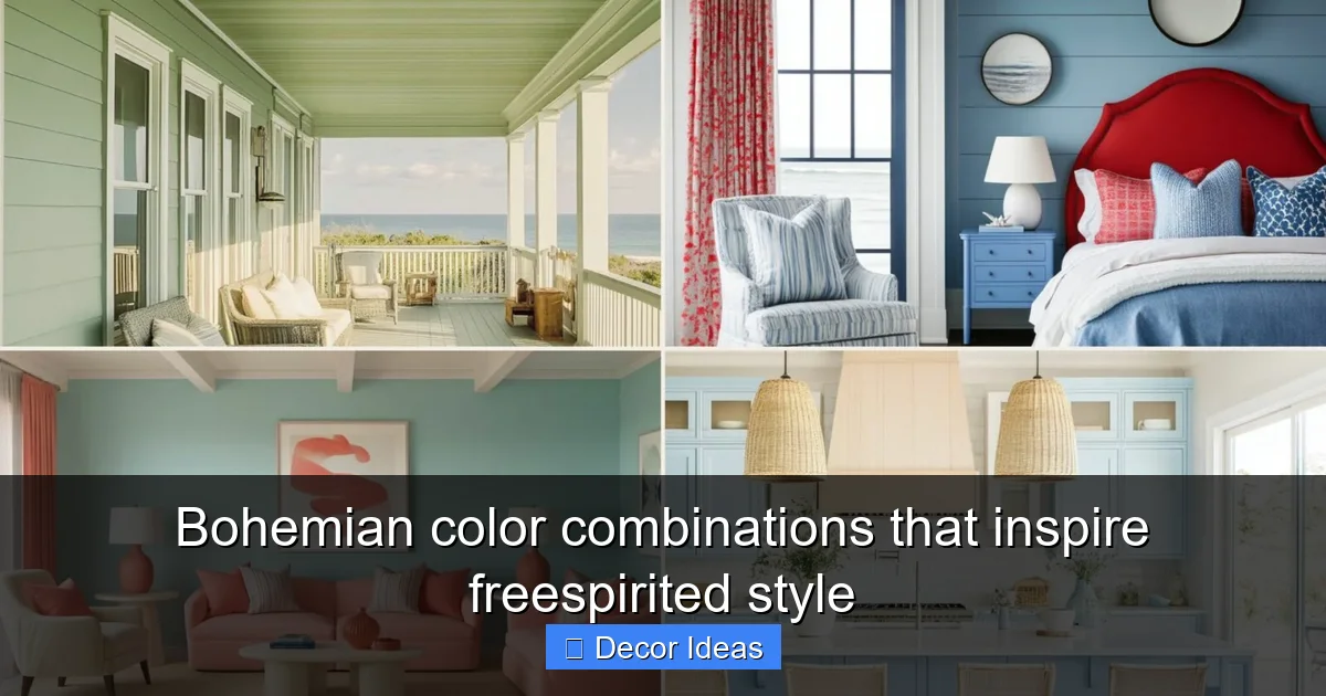
Top Bohemian Color Combinations to Try
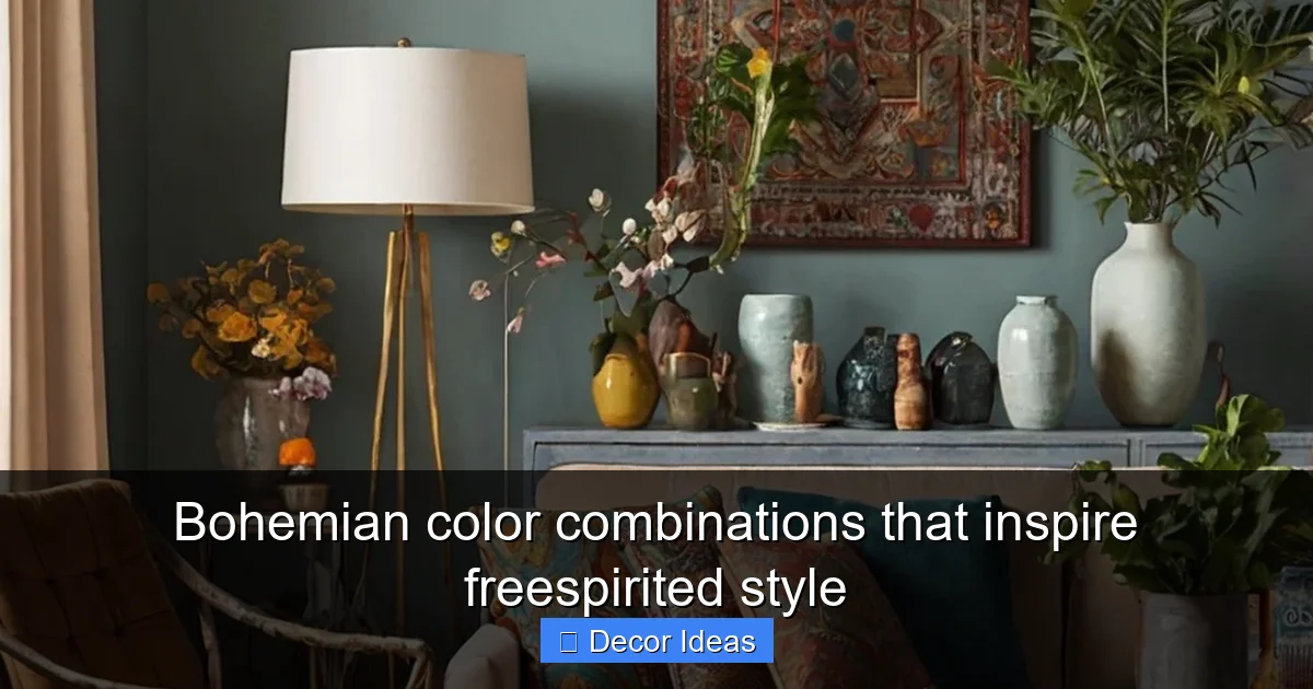
Visual guide about Bohemian color combinations that inspire freespirited style
Image source: westpearinteriors.com
Now that we’ve covered the basics, let’s dive into some of the most inspiring bohemian color combinations you can use in your home. These palettes are versatile, mood-boosting, and perfect for creating a free-spirited vibe.
1. Jewel Tones with Warm Neutrals
One of the most classic bohemian color combinations pairs rich jewel tones with warm, earthy neutrals. Think emerald green, sapphire blue, and amethyst purple balanced with terracotta, camel, and warm white.
This combination works beautifully in living rooms and bedrooms. For example, paint one wall a deep emerald green and use terracotta throw pillows, a camel-colored area rug, and brass accents to tie everything together. The jewel tones add drama and sophistication, while the neutrals keep the space grounded and cozy.
Tip: Use jewel tones on larger surfaces like walls or furniture, and let neutrals dominate smaller accents like curtains or bedding to avoid overwhelming the room.
2. Earthy Reds and Mustard Yellows
For a warm, sun-drenched feel, try combining earthy reds—like burnt sienna or rust—with mustard yellow and olive green. This palette is inspired by desert landscapes and Mediterranean villas, making it ideal for creating a relaxed, vacation-like atmosphere.
Use this combination in a dining room or sunroom. A rust-colored accent wall paired with mustard yellow chairs and olive green drapes creates a vibrant yet balanced look. Add woven baskets, clay pots, and wooden tables to enhance the natural vibe.
This palette also works well in kitchens. Consider painting cabinets in a soft mustard hue and pairing them with terracotta backsplash tiles and copper hardware.
3. Teal, Coral, and Cream
If you love bold, playful colors, the teal, coral, and cream combination is a fun and fresh take on bohemian style. Teal brings a cool, calming energy, while coral adds a pop of warmth and energy. Cream acts as a soft, neutral base that keeps the palette from feeling too busy.
This trio is perfect for a bedroom or home office. Imagine teal walls, coral bedding, and cream curtains. Add a few gold accents—like a mirror or picture frame—and you’ve got a space that’s both energizing and serene.
Tip: Use coral sparingly as an accent color in pillows, artwork, or a single chair to prevent it from dominating the room.
4. Deep Purple, Gold, and Sage Green
For a more luxurious bohemian look, try deep purple, gold, and sage green. This combination feels regal yet relaxed, making it ideal for a reading nook or meditation space.
Deep purple walls or a velvet sofa create a dramatic backdrop, while sage green adds a touch of nature and calm. Gold accents—like a lamp, vase, or decorative tray—bring in a touch of glamour without being over the top.
This palette works especially well in small spaces where you want to create a cozy, intimate atmosphere. The deep colors make the room feel enclosed and peaceful, perfect for unwinding after a long day.
5. Terracotta, Olive, and Cream
Inspired by Mediterranean and Southwestern design, this earthy trio is all about warmth and simplicity. Terracotta brings a rich, clay-like red, olive green adds a natural touch, and cream keeps everything light and airy.
Use this combination in a kitchen or bathroom. Terracotta floor tiles, olive green cabinets, and cream countertops create a harmonious, rustic look. Add woven textiles, clay pots, and wooden cutting boards to complete the vibe.
This palette is also great for outdoor spaces. A terracotta patio with olive green cushions and cream outdoor rugs feels inviting and timeless.
How to Layer Colors and Textures
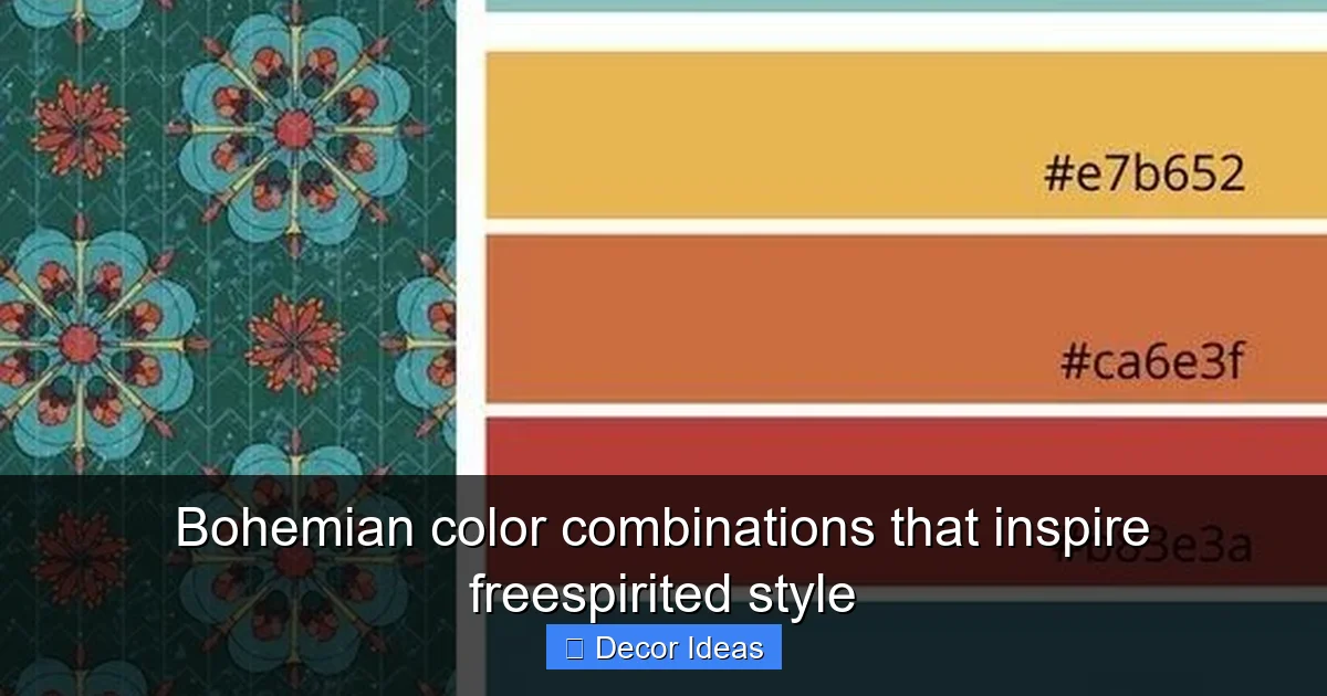
Visual guide about Bohemian color combinations that inspire freespirited style
Image source: i.pinimg.com
One of the secrets to mastering bohemian color combinations is layering. Unlike other design styles that focus on minimalism, boho thrives on abundance—multiple textures, patterns, and colors working together in harmony.
Start with a Base Color
Begin by choosing a dominant color for your walls, large furniture pieces, or flooring. This will serve as the foundation of your palette. For example, a warm beige wall can support almost any bohemian color combination, while a bold emerald wall sets a more dramatic tone.
Add Secondary and Accent Colors
Once your base is set, introduce secondary colors through textiles like rugs, curtains, and bedding. These should complement your base without competing with it. Finally, use accent colors in smaller items—pillows, vases, artwork—to add pops of interest.
For instance, in a room with terracotta walls, you might use olive green curtains, a cream rug, and coral throw pillows. The terracotta is the base, olive and cream are secondary, and coral is the accent.
Mix Patterns with Purpose
Bohemian style loves patterns—but that doesn’t mean you should throw every pattern you own into one room. Instead, mix patterns with intention. Pair a large-scale ikat print with a small paisley or a geometric tribal design.
Tip: Stick to a consistent color palette when mixing patterns. Even if the designs are different, shared colors will help them feel cohesive.
Incorporate Natural Textures
Texture is just as important as color in bohemian design. Use materials like jute, wool, cotton, and linen to add depth and warmth. A jute rug under a wool pouf, for example, creates a layered, tactile experience.
Don’t forget about plants! Greenery in woven baskets or clay pots adds life and softness to any space.
Lighting and Bohemian Color Harmony
Visual guide about Bohemian color combinations that inspire freespirited style
Image source: cdn.enthrallinggumption.com
Lighting plays a crucial role in how bohemian color combinations are perceived. Natural light enhances warm tones and makes jewel colors pop, while artificial lighting can either support or undermine your palette.
Maximize Natural Light
Whenever possible, let natural light flood your space. Sheer curtains in cream or pale yellow allow sunlight to filter in softly, highlighting the richness of your colors. Avoid heavy, dark drapes that can make a room feel closed off.
Use Warm Artificial Lighting
In the evening, opt for warm-toned bulbs (2700K–3000K) to maintain the cozy, inviting feel of your bohemian space. Avoid cool, blue-tinted lighting, which can make warm colors look dull.
Add layered lighting with floor lamps, table lamps, and string lights. A Moroccan-style lantern with a warm bulb can cast beautiful, patterned light across a wall, enhancing the boho vibe.
Bringing Bohemian Style to Every Room
Bohemian color combinations aren’t limited to living rooms or bedrooms—they can transform any space in your home.
Kitchen
In the kitchen, use warm neutrals like terracotta or olive for cabinets or backsplashes. Add pops of color with colorful dishware, a vibrant rug, or a painted ceiling in a soft teal or mustard.
Bathroom
Create a spa-like retreat with sage green walls, cream tiles, and gold fixtures. Add a woven basket for towels and a few potted plants for a natural touch.
Home Office
Boost creativity with a deep purple accent wall, a mustard yellow desk chair, and cream shelving. Hang colorful artwork and use a patterned rug to define the space.
Conclusion
Bohemian color combinations are more than just a trend—they’re a lifestyle. They invite you to break the rules, embrace your individuality, and create a home that truly reflects who you are. Whether you’re drawn to rich jewel tones, earthy reds, or playful coral and teal, there’s a bohemian palette that will speak to your soul.
The key is to have fun with it. Mix patterns, layer textures, and don’t be afraid to experiment. Remember, bohemian style isn’t about perfection—it’s about feeling. So go ahead, paint that wall emerald, drape that macramé curtain, and fill your space with colors that make your heart sing. Your free-spirited sanctuary is waiting.
🎥 Related Video: How to Style Boho Fashion Colors and Details. Boho Fashion Style Guide: Embracing Colors and Details
📺 Fashion Tips
bohofashion #styleinspiration #vintagefashion Boho style represents a free-spirited, relaxed, and natural approach to fashion.
Frequently Asked Questions
What defines a bohemian color palette?
A bohemian color palette typically includes rich jewel tones, earthy neutrals, and vibrant accent colors. It emphasizes warmth, depth, and cultural diversity.
Can I use black in bohemian decor?
Yes, but use it sparingly. Black can ground a space, but too much can make it feel heavy. Pair it with warm metallics or soft neutrals to balance the look.
How do I add bohemian colors to a rental apartment?
Use removable wallpaper, colorful rugs, throw pillows, and artwork to introduce bohemian colors without making permanent changes.
Are bohemian colors good for small spaces?
Yes, when used wisely. Lighter base colors with bold accents create depth without overwhelming a small room.
What fabrics work best with bohemian colors?
Natural fabrics like cotton, linen, wool, and jute enhance the tactile, earthy feel of bohemian decor.
How can I make my bohemian space feel cohesive?
Choose a consistent color palette and repeat key colors throughout the space in different textures and patterns.